Usability of System for Lecturers
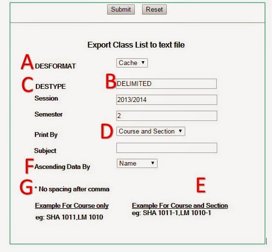
One of IIUM system (or 'apps') is used to download class list. This system is to be used by lecturers. What's wrong (in terms of the usability) of the system's interface?
A. What is DESFORMAT? Can you please use a plain language? What are the differences among the options listed (File, Cache, Printer and Mail)?
B. There’s no choice available for this box. And I don’t know what it is supposed to be for. Do we really need it here?
C. Can we not have a default session value that is up to date? Please update the default value once a new semester starts. Or have a pull-down menu to select the session.
D. The CAM Entry system lists the students by Matric Number. Can we please have Matric No. as the default setting here too?
E. With Roman writing, we read it from top to bottom. Can we please have the ‘Submit’ and ‘Reset’ button at the bottom right of the menu (somewhere near E)? It feels more natural to have it there. It is strange to go down towards ‘Ascending Data By’ and then have to go up to execute the command.
F. I strongly believe there is a simpler term than ‘Ascending Data By’.
G. What is this asterisk for? Where does it refer to? It sounds like a footnote. Where is the part that it is referring to? It is not located near the box that it is referring to. Additionally, it is natural for people to add space after a comma. Why shouldn’t the system be intelligent enough to accept space after a comma?I have emailed the suggestions to the IT Department. Hopefully the system (and other systems) would be improved soon.

Comments